
Two lights can produce similar lumens, use similar wattage and have the same colour temperature—yet make a room look and feel completely different.
One may reveal colours naturally and distribute light smoothly. Another may flatten textures, distort finishes, create uncomfortable glare or behave poorly when dimmed.
This difference is light quality.
Good lighting is not determined by brightness alone. Colour rendering, colour consistency, glare, flicker, beam control and dimming performance all influence how comfortably and accurately we see a space.
This guide explains the main qualities to compare so you can look beyond wattage and lumens when choosing LED lighting.
What Makes Light Good Quality?
Light quality describes how light appears, performs and interacts with the people, colours and materials inside a space.
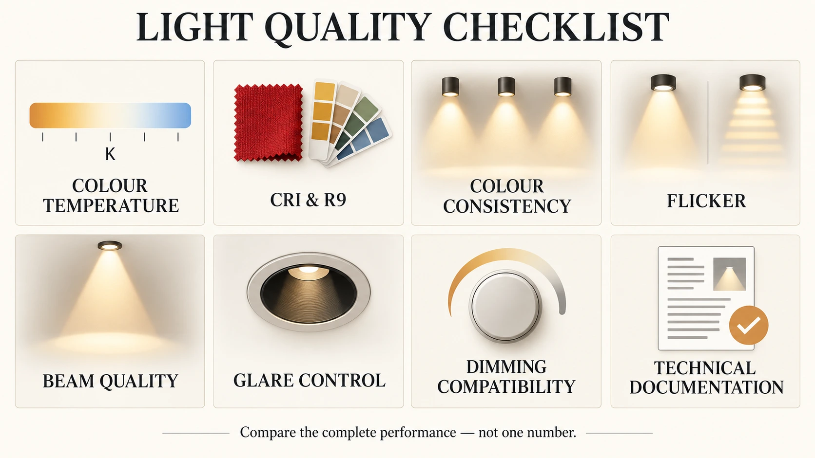
It is not represented by one universal score. Instead, several characteristics work together:
- Colour temperature affects whether the light appears warm, neutral or cool.
- Colour rendering affects how accurately colours and finishes appear.
- Colour consistency determines whether multiple lights match one another.
- Glare control influences visual comfort.
- Flicker performance affects how stable the light appears to people and cameras.
- Beam quality affects how smoothly and evenly light is distributed.
- Dimming quality determines how well the light responds when its output is reduced.
The importance of each quality depends on the application. Colour rendering may be especially important in a clothing shop, while glare control may be the greater concern in an office. A restaurant may need both accurate food presentation and smooth dimming for different times of day.
The goal is not to find one specification that is always “best.” It is to choose the combination of qualities that supports how the space will be used.
Lumens Tell You How Much Light, Not How It Looks
Watts, lumens and lux describe different parts of lighting performance:
- Watts (W) measure the electrical power consumed.
- Lumens (lm) measure the visible light produced by a lamp or luminaire.
- Lux (lx) measure how much light reaches a surface.
These values help determine whether a room will receive enough light, but they do not fully describe what that light will look like.
Two fixtures with the same lumen output can differ considerably in colour accuracy, glare, beam uniformity and visual comfort. They may also distribute their light differently, so the same number of lumens does not guarantee the same result on the floor, walls or work surface.
Brightness and efficiency therefore form only one part of the decision. Once the required light level is established, the quality of that light must also be considered.
Continue with: Lux and Lumens Lighting Guide
Calculate your requirement: Lux & Lumens Calculator
Colour Temperature Changes the Atmosphere
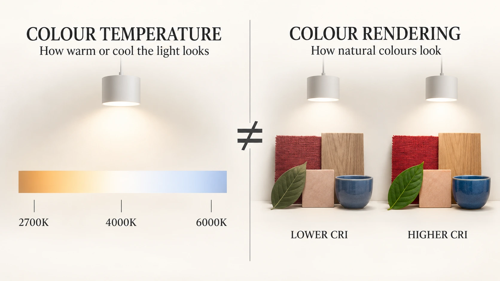
Colour temperature describes whether white light appears warm, neutral or cool. It is measured in kelvin and written using the symbol K.
Lower colour temperatures produce a warmer appearance with more yellow or amber tones. Higher colour temperatures appear whiter or cooler.
| Colour temperature | General appearance | Common applications |
|---|---|---|
| 2700K | Warm and relaxed | Bedrooms, lounges and intimate hospitality spaces |
| 3000K | Warm but clearer | Homes, restaurants, boutiques and decorative lighting |
| 4000K | Neutral and focused | Offices, kitchens, work areas and many commercial spaces |
| 5000K and above | Cool and crisp | Specialist task, display or industrial applications |
Colour temperature can strongly influence the atmosphere of a room, but it does not indicate how accurately colours will appear.
For example, two lamps may both be labelled 3000K while rendering skin tones, fabrics, wood and artwork very differently. Colour temperature tells you the general appearance of the white light; colour-rendering measurements help describe how objects will look under it.
There is also no single colour temperature that is correct for every room. The appropriate choice depends on the materials, desired atmosphere, tasks performed and surrounding lighting.
Explore the detailed comparison: 3000K vs 4000K Lighting: Which Is Better for Your Space?
CRI Explained: How Accurately Light Reveals Colour
The Colour Rendering Index, usually shortened to CRI, describes how faithfully a light source reveals colours compared with a reference light source.
CRI is commonly presented with 100 as the highest reference value. A higher number generally indicates better colour fidelity, but the number should be understood as a useful comparison—not a complete description of light quality.
As a practical guide:
- CRI 80+ is suitable for many general lighting applications.
- CRI 90+ is preferable where colours, finishes and skin tones need to appear more natural.
- Specialist retail, hospitality, art and presentation spaces may require closer attention to individual colour-rendering values.
The difference becomes especially noticeable when lighting materials such as wood, fabric, artwork, food, cosmetics and decorative finishes. Under weaker colour rendering, these materials may appear dull, flat or slightly different from their appearance in daylight.
A high CRI does not make a light warmer, cooler or brighter. It describes colour fidelity, while colour temperature and lumen output describe different characteristics.
Why CRI Does Not Tell the Whole Story
The commonly published general CRI value—also called Ra—is calculated from a group of test colours. Because it represents an average, two light sources with the same stated CRI can still reproduce particular colours differently.
This is why applications where colour presentation matters should not be evaluated using the headline CRI value alone.
Why R9 Matters for Reds, Skin Tones and Materials
R9 is a special colour-rendering value used to evaluate how a light source reproduces saturated red.
R9 becomes particularly important when lighting skin tones, food, warm wood, red and brown fabrics, cosmetics, artwork and decorative finishes.
- Skin tones
- Food and fresh produce
- Warm wood
- Red and brown fabrics
- Artwork
- Cosmetics
- Flowers and decorative finishes
R9 is not included in the calculation of the commonly displayed general CRI value. A lamp can therefore have an acceptable headline CRI while performing less effectively with saturated reds.
When accurate colour presentation is important, look for both the general CRI and the R9 value rather than relying on CRI alone.
| Application | Practical colour-rendering priority |
|---|---|
| Corridors and basic circulation areas | Good general CRI is usually sufficient |
| Living rooms and bedrooms | Natural fabrics, finishes and skin tones |
| Kitchens and dining areas | Accurate food and surface colours |
| Clothing and furniture retail | High colour fidelity and strong red rendering |
| Restaurants and cafés | Natural food presentation and warm materials |
| Dressing rooms and beauty areas | Accurate skin tones, fabrics and cosmetics |
| Artwork and decorative displays | Careful evaluation of the colours being illuminated |
The appropriate specification still depends on the project. A higher value is useful only when the rest of the lighting design—beam control, glare, placement and light level—also supports the space.
Apply these priorities using the Retail and Showroom Lighting Guide, Restaurant and Café Lighting Guide and the wardrobe and dressing-area advice in the Bedroom Lighting Guide.

Why Matching Lights Can Still Look Different
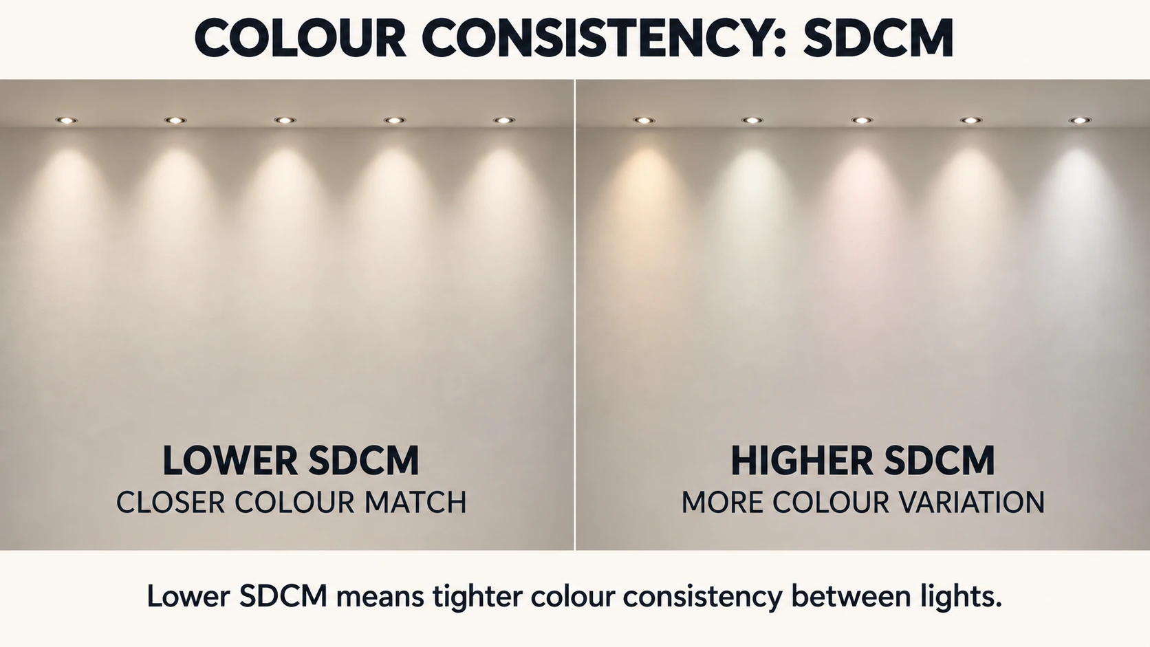
Two lamps can both be labelled 3000K and still appear slightly different when installed beside one another.
One may look marginally greener, pinker, warmer or cooler. These variations can become especially noticeable when several lights illuminate the same white wall, ceiling, shelf or continuous surface.
SDCM, meaning Standard Deviation Colour Matching, describes the degree of possible colour variation between light sources. It is also commonly expressed using MacAdam steps.
The lower the SDCM value, the tighter the expected colour consistency.
| SDCM range | Practical interpretation |
|---|---|
| 1–2 SDCM | Very tight colour consistency |
| 3 SDCM | Strong consistency for quality installations |
| 4–5 SDCM | Differences may become noticeable, depending on the setting |
| Higher values | Visible variation becomes increasingly likely |
Small differences may be difficult to notice when fixtures are separated or illuminate different surfaces. The same variation can become obvious when multiple spotlights, track lights or linear luminaires are positioned close together.
Colour consistency deserves particular attention in:
- Long track-lighting installations
- Wall-washing
- Linear lighting
- Retail shelving
- Display lighting
- Repeated ceiling spotlights
- Open-plan commercial spaces
SDCM does not describe colour rendering. CRI and R9 concern how illuminated objects appear, while SDCM concerns how closely the light colour of one source matches another.
For larger installations, using compatible products from consistent production batches can also help reduce visible differences.
Bright Light Is Not Always Comfortable Light
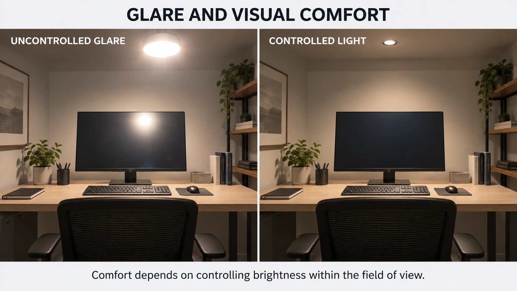
Glare occurs when a light source or reflection is bright enough to cause discomfort, distraction or difficulty seeing clearly.
A room can meet its required lux level and still feel uncomfortable if the light sources are too exposed, positioned poorly or reflected into the viewer’s eyes.
Two common forms are:
- Direct glare: caused by seeing a bright lamp, LED module or luminaire directly.
- Reflected glare: caused when light reflects from glossy surfaces, screens, glass, polished stone or other reflective materials.
Glare can often be reduced through a combination of:
- Recessed or shielded light sources
- Appropriate diffusers, lenses and reflectors
- Controlled beam angles
- Careful fixture placement
- Lower luminance within normal viewing angles
- Balanced brightness between surfaces
- Reduced reflections on screens and glossy materials
A narrow beam is not automatically glare-free. If the light source remains visible or is aimed toward the viewer, it can still cause discomfort. Similarly, a diffuser may soften the appearance of a fixture but will not correct poor positioning by itself.
What Does UGR Mean?
UGR, or Unified Glare Rating, is a method used to assess discomfort glare in indoor lighting installations, particularly workplaces.
A lower calculated UGR generally indicates less predicted discomfort glare. However, UGR should not be treated as a universal fixed number belonging only to a luminaire. The result also depends on the room, fixture arrangement, viewing direction and observer position.
For homes and smaller projects, practical glare control begins by considering what people will see from seated, standing and working positions. In commercial offices, formal glare assessment becomes more important and will be covered in the dedicated Commercial Office Lighting Guide.
Comfortable lighting is not simply dim lighting. The objective is to provide enough useful light while controlling excessive brightness within the field of view.
Flicker You May Not See Can Still Affect Light Quality
Flicker is the variation of light output over time.
Severe flicker may be immediately visible, but other variations happen too quickly to be consciously noticed. They may instead appear as:
- Distracting effects when objects move
- Repeated patterns or broken motion
- Bands across photographs or video
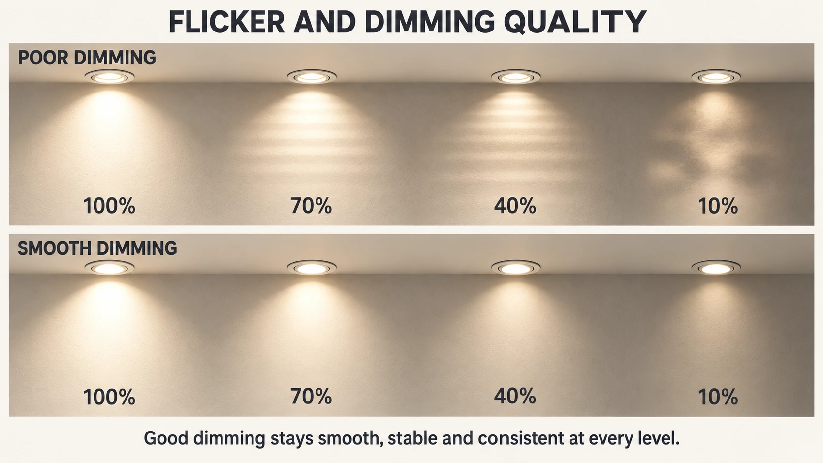
- Unstable behaviour when the light is dimmed
- A general impression that the lighting is visually uncomfortable
LEDs respond rapidly to changes in electrical current, so their flicker performance depends strongly on the driver and control system. Poor driver design, incompatible dimmers or unstable power can all affect how consistently the light operates.
A phone camera may reveal dark bands under some problematic lights, but it is not a complete technical test. Camera settings, frame rate and shutter speed can change what appears on the screen.
For projects where flicker performance is important, look for documented test information rather than relying only on a general “flicker-free” claim. Professional specifications may include measurements for visible flicker and stroboscopic effects.
Also check the light at different dimming levels. A product that appears stable at full output may behave differently near the bottom of its dimming range.
A Good Beam Should Look Controlled and Consistent
Beam angle describes how widely a directional light spreads, but it does not describe the full quality of the beam.
Two spotlights with the same stated beam angle can still produce noticeably different results. A well-controlled beam should generally provide:
- A smooth transition from the centre to the edge
- Consistent colour across the illuminated area
- Appropriate control of spill light
- Predictable shadows
- No distracting bright rings or dark patches
- A suitable balance between the hotspot and surrounding light
A strong central hotspot may be useful when highlighting a small object, but it can appear uneven when used for general lighting or wall illumination. Excessive spill light can also reduce contrast and illuminate areas that were intended to remain quieter.
Beam quality becomes especially important when several spotlights are installed together. Poorly matched beams can create irregular patches, repeated bright spots or visible gaps across the room.
The best beam depends on what is being illuminated:
- Narrower controlled beams can emphasize artwork, displays and architectural details.
- Medium beams can provide balanced accent lighting.
- Wider beams can cover larger surfaces or support more general illumination.
Fixture distance also changes the illuminated area. As the distance from the surface increases, the beam spreads wider.
Choose the appropriate spread: How to Choose the Right Beam Angle
Compare beam width at different distances: Beam Angle & Light Spread Calculator
Plan spotlight spacing: Spotlight Layout Calculator
Good Dimming Is More Than Making Light Darker
A dimmable label only confirms that a light is designed to reduce its output. It does not guarantee that every lamp, driver, dimmer and control system will work smoothly together.
Good dimming should feel gradual and predictable. Watch for:
- Flicker during adjustment
- Sudden jumps between light levels
- Lights that switch off before reaching a useful low level
- Delayed starting or inconsistent response
- Buzzing from the lamp, driver or dimmer
- Different fixtures dimming at different rates
- Unwanted changes in colour appearance
Compatibility matters because LED products and dimming systems do not all use the same control method. A dimmable LED may still perform poorly when connected to an incompatible dimmer or when too few or too many products are placed on the same circuit.
Some products are intentionally designed to become warmer as they dim. This is called dim-to-warm and can create an effect similar to traditional incandescent lighting. Other products are designed to maintain approximately the same colour temperature throughout the dimming range.
Neither approach is automatically better. What matters is that the behaviour is intentional, consistent and suitable for the atmosphere of the space.
Where dimming is important, test the proposed lamp, driver and control combination before repeating it across an entire project.
Which Light-Quality Factors Matter Most?
Every space benefits from good lighting, but the priorities change according to the people, activities and materials being illuminated.
| Application | Most important light-quality priorities |
|---|---|
| Living rooms and bedrooms | Comfortable colour temperature, controlled glare, natural colours and smooth dimming |
| Commercial offices | Glare control, low flicker, consistent light colour and balanced brightness |
| Retail and showrooms | High colour fidelity, strong R9, consistent beams and effective accent lighting |
| Restaurants and cafés | Natural food rendering, warm materials, controlled glare and smooth scene-setting |
| Dressing rooms and wardrobes | Accurate skin tones, fabrics and cosmetics with even facial lighting |
| Artwork and displays | Colour fidelity, beam control, consistency and careful placement |
| Terraces, balconies and gardens | Controlled distribution, limited glare, appropriate colour temperature and visual continuity |
These priorities should guide the questions asked when comparing products. They do not replace the need to calculate the required light level, choose suitable fixture positions or confirm technical compatibility.
A successful lighting plan brings these decisions together:
- Provide the right amount of light.
- Distribute it where it is needed.
- Reveal colours and materials appropriately.
- Control glare and flicker.
- Maintain consistency between fixtures.
- Confirm that dimming and controls work as intended.
Later application guides will translate these principles into room-specific layouts and decisions. This guide will remain the central technical reference for understanding light quality.
What to Check Before Choosing an LED Light
A product does not need the highest available value in every category. It needs the right combination of performance for its intended application.
Before choosing an LED lamp or luminaire, check:
- Colour temperature: Does the light create the intended atmosphere and suit the surrounding materials?
- CRI: Is the general colour fidelity appropriate for the space?
- R9: Will reds, skin tones, food, fabrics or warm finishes need accurate rendering?
- Colour consistency: Is an SDCM or MacAdam-step value available when several matching lights will be installed?
- Flicker performance: Is useful test information provided beyond a general “flicker-free” claim?
- Beam angle and distribution: Does the light cover the intended area smoothly and without unwanted spill?
- Glare control: Is the source recessed, shielded or diffused appropriately for normal viewing positions?
- Dimming: Is the product dimmable, and is it compatible with the proposed driver, dimmer or control system?
- Technical documentation: Are the performance values clearly stated and supported by reliable product information?
Not every specification appears on basic packaging or product pages. For projects where colour accuracy, dimming, consistency or visual comfort is important, request the relevant technical information before making the final selection.
Choose Light for How It Performs
Light output tells you how much light is available. Light quality determines how that light appears, behaves and feels within the space.
The best choice balances colour appearance, colour fidelity, consistency, glare, flicker, beam control and dimming with the needs of the people, activities and materials being illuminated. Compare the complete performance—not one impressive specification.
Continue Planning Your Lighting
Use these guides and tools to turn light-quality principles into practical decisions.
3000K vs 4000K Lighting
Compare warm and neutral-white lighting and choose an appropriate colour temperature for different rooms.
Read the 3000K vs 4000K Lighting Guide
Lux and Lumens Lighting Guide
Understand how much light a room needs and how lumens, lux and room size work together.
Read the Lux and Lumens Lighting Guide
Beam Angle Guide
Choose between narrow, medium and wide beams according to mounting height, distance and the area being illuminated.
Lighting Tools
Use Saleh Deco’s calculators and planning tools to estimate light levels, beam spread, spotlight layouts, LED drivers and fixture proportions.
Frequently Asked Questions
What is considered good light quality?
Good light quality provides enough useful illumination while revealing colours appropriately, controlling glare, maintaining consistency and operating without distracting flicker. The right balance depends on the application because a home, office, shop and restaurant do not have identical lighting priorities.
Is CRI 90 better than CRI 80?
CRI 90 generally provides higher colour fidelity than CRI 80 and is preferable where skin tones, food, fabrics, artwork or decorative finishes need to appear natural. CRI 80 can still be suitable for many general lighting applications where precise colour presentation is less important.
What does R9 mean in lighting?
R9 measures how a light source renders saturated red. It is particularly relevant to skin tones, food, wood, warm fabrics, cosmetics and artwork. R9 is not included in the commonly displayed general CRI average, so it should be checked separately when red rendering matters.
Can two 3000K lights look different?
Yes. Two lights can share the same nominal colour temperature while having slightly different colour coordinates or colour-rendering characteristics. SDCM helps describe expected colour variation between sources, while CRI and R9 describe how illuminated colours are rendered.
What causes LED lights to flicker?
LED flicker can result from the driver, electrical supply, control method or an incompatible dimmer. Some flicker is immediately visible, while other temporal effects may become apparent through movement, low dimming levels or camera banding.
How can lighting glare be reduced?
Glare can be reduced by shielding or recessing bright sources, selecting suitable optics, positioning fixtures outside common viewing angles, controlling reflections and balancing brightness across the room. The goal is to maintain useful illumination without excessive brightness entering the field of view.